phoning in the concrete
Fuzzy Logic – Contemporary Painting after a Century of Abstract Art
Trans: form | color
@ Meridian Gallery San Francisico left Brent, right Leo
~a flickr photo view of the exhibition + Meridian’s homepage with accompanying events + review of Trans: form|color by Kenneth Baker for the San Francisco Chronicle.
“If asked to guess which Trans painter lives in Tokyo, I would have guessed – correctly – Brent Hallard. He works on stacked sheets of plastic in a manner that alludes both to hard-edge abstraction and shaped canvases of the 1960s and the shrill, brittle cuteness of Japanese pop culture – the most conspicuous tension registered in the Meridian show.” Kenneth Baker for the San Francisco Chronicle
Read more…
“Abstract painting has a history of about a hundred years. “Abstract” is really a misnomer, as the artist does not depart from the reality of the outside world, but creates his/her own visual presence” … snippet from catalogue notes by Peter Selz
Straw
Studiomo
I’ve been working in my studio with three scales: small, about 15” 35cm; mid, 70~80cm; and a larger scale.
With the small scale, after about a year of working with the ‘L’ [I have over a 100] I found particular systematized numbers and proportions would allow the focus to be on anomaly more than, say, looking for variation. Still hard because as you know anomaly is the thing that the eye and brain is most likely to clean up to standardize back to regular experience. That is where the hunt is.
I would find what I thought were good numbers but then they’d fail: Again, and again, until the same number/space came up.
Not particularly conscious of it, but at the time there was this concern for line. For me the line is the most object part, but also as color needs to work as space and articulator simultaneously… so there are these problems… sorted out in small scale. [See above the little drawing made after the large-scale template – 35 cm with a colored back, front using a sharpie marker to articulate edge and inner delineation.]
Then in June I began making small scale and mid-scale at the same time paying attention to this color/line/angle, the relation to the surface/object with the line just pushed outside the limits of what one would normally describe as line, into a measured, contained, field of color… then to the larger scale… where upon again the problem arose… finally the thickness needed to be visually reworked, numerically systematized, along with reassessing object-hood… adding transparent layers of core plastic running in pairs this time so the ribs are seen the same way, so as an object, when you look at the side you can actually see right through to the other side. When this transparency and tunnel is set next to a color insert with the ribs running the other way, the clear layers pick up the color and play with it. This and all the other ‘presents’ register, for the moment, a problem of scale solved…
MINUS SPACE Viewlist: Bulletin Board
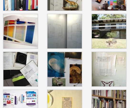
VIEWLIST Bulletin Board: Inspiration Information, Conceived by Karen Schifano posted July 21st, 2009 Viewlist is MINUS SPACE’s new online project space where we invite artists and others to curate a visual essay of images. Viewlist exhibitions are generally thematic and can include art works spanning various time periods, movements, and geographic locations. Exhibitions may also include ideas and images from disciplines outside of the visual arts. Our third viewlist exhibition is conceived by New York painter Karen Schifano.
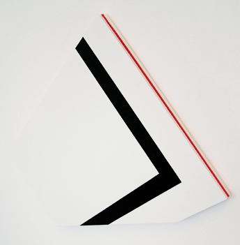
Black Wall
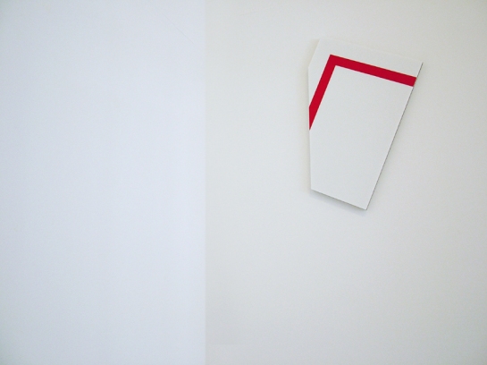
Red – Flat
Splash
Space, Thing, and Perception
 Image: local Parisians pop in after work
Me [Brent] giving instructions over the phone:
OK I fiddled around with space in Photoshop. In the image it looks better with just one piece on that wall, either the black, or red as edited in jpg.
The other piece could go on either other small wall.
This means if you take out the red it could go on that small wall to the right, so that when you see it you are likely to notice the middle plastic bit, which can work helping to play with scale. Then you can move around to get a different view.
If you take the black one out then you can put that on the small wall to the left, so you see the middle layer of plastic first and an extreme angle.How it was last night looks OK but also very regular,contained within the narrow frame and not dialogging with the real space.
With a single image on that framed wall as you can see in the images, the space seems to come alive much more and the scale feels shifting, opening the space and expanding it.
If you wouldn’t mind giving that a go:) and send an image thru.
Richard van der Aa [Parisconcret]
As you say it opens up the relations in a much more dynamic way – working with third dimension like that. There is a very nice shift as the viewer moves in the room as well.
Richard Schur [Paris, after the opening]
Your pieces worked very well in the space, the feeling in reality was even much better than on the attached images… I found the installation perfect, nothing to criticize about the positioning and a thrilling tension between the two pieces. I like the interaction between the red and black and the “sandwich” thing 🙂


